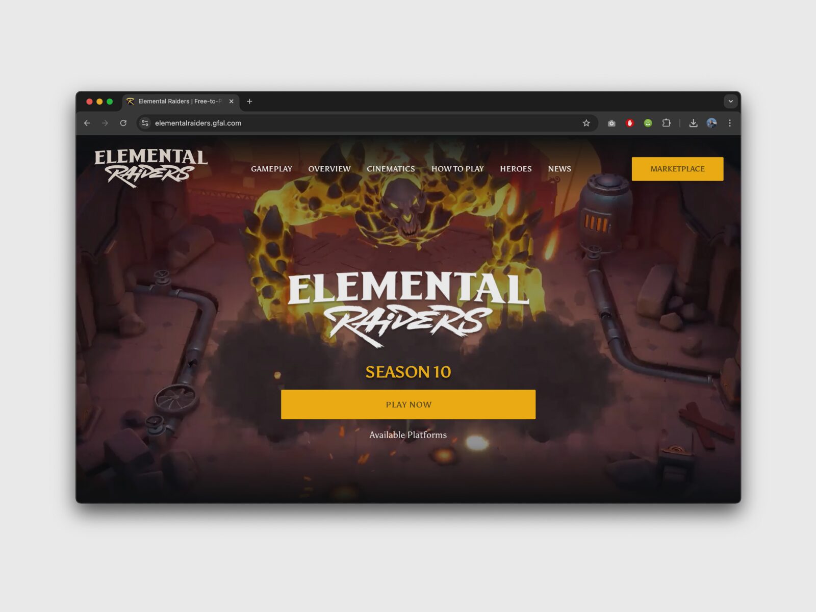
Website and GFAL Launcher
1. Discovery
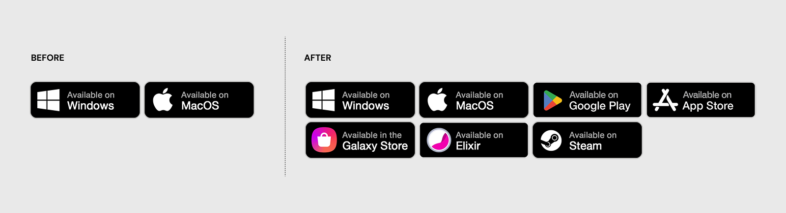
Elemental Raiders’ expansion across four+ platforms happened faster than its website could keep up. The original two-button simplicity for PC and Mac devolved into a cluttered row of platform-specific CTAs. By trying to serve every device equally, the interface lost its focus, forcing players to navigate a list with too many options.
The Cost of Growth
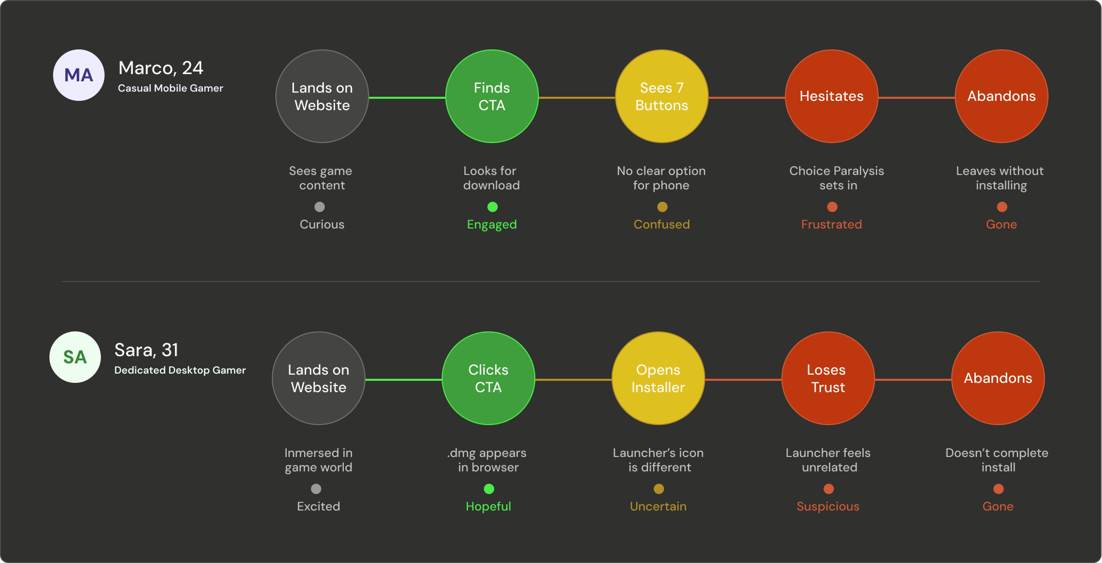
Analytics made the cost visible. Players were clicking the primary call to action but a significant share were never completing the installation. The drop-off was concentrated on desktop, where the launcher was downloaded as a raw .exe or .dmg file appearing unexpectedly in the browser without any context or clear instructions.
2. Research
To ground the research in real behaviour, we defined two composite personas representing the two distinct journeys.
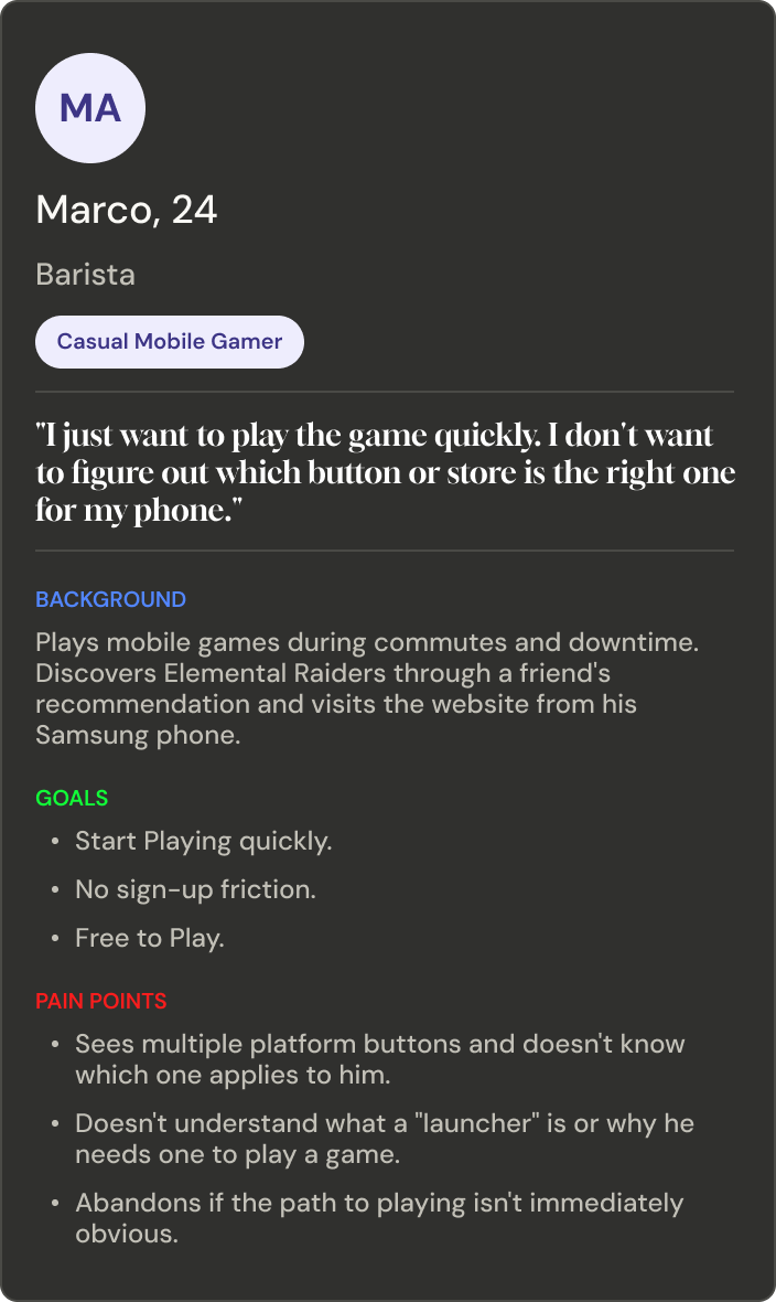
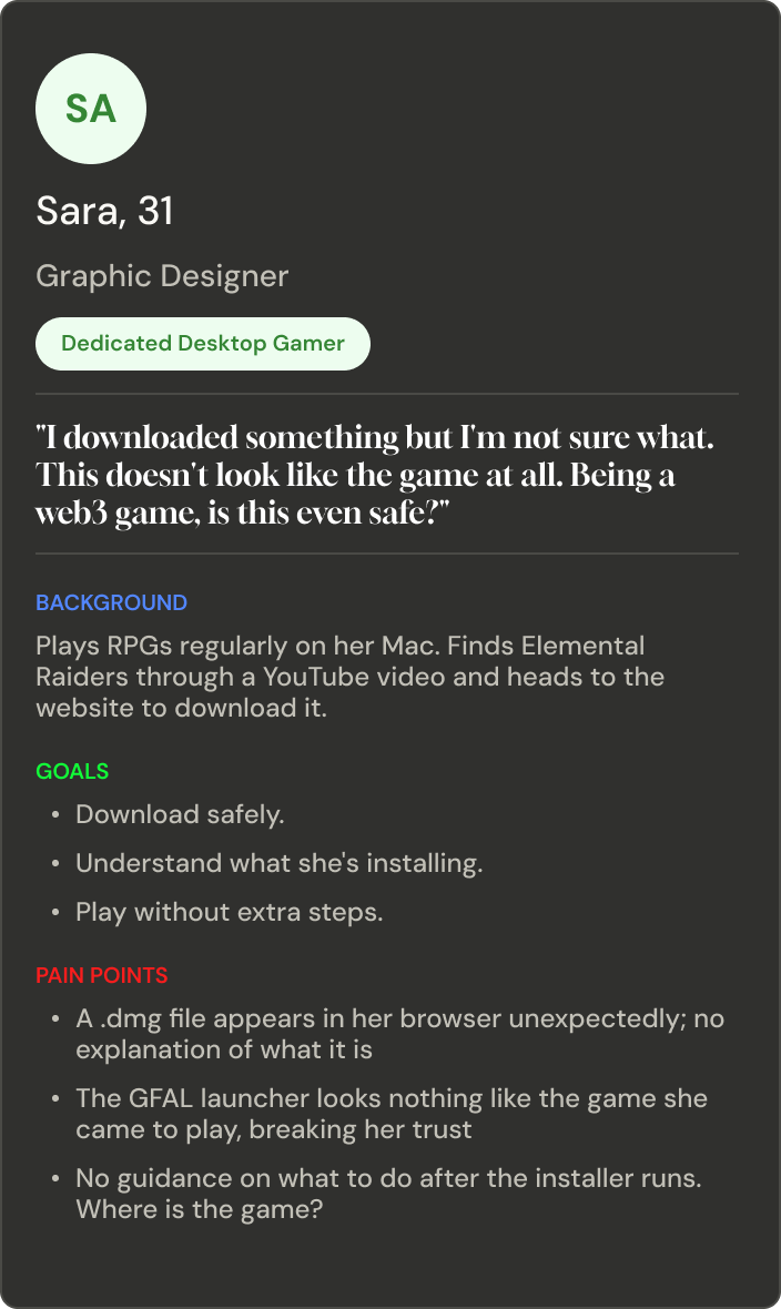
Personas
Research identified two core breakdowns in the user journey:
Decision Friction
While platforms like Steam, Elixir and the Galaxy Store were available, surfacing them equally with the direct download created "choice paralysis." We needed to distinguish between prominence and presence.
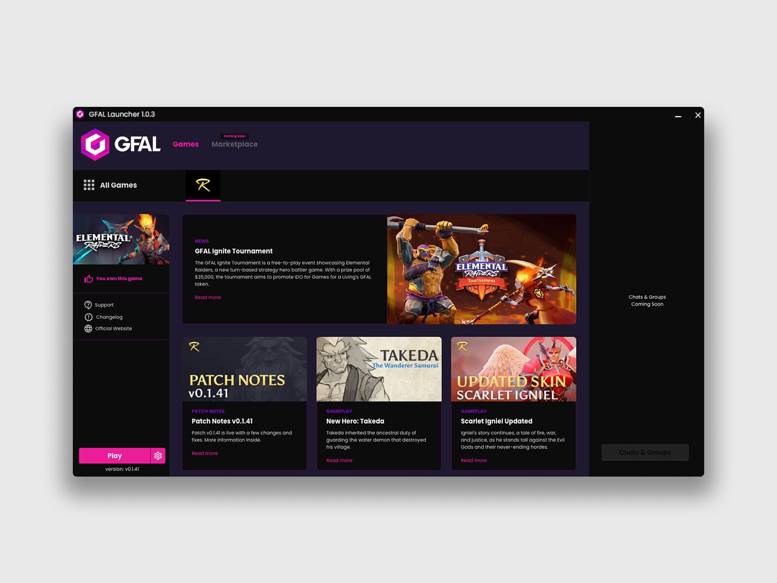
The Trust Gap
The "GFAL Launcher" carried corporate branding rather than the game’s visual identity. Players immersed in a fantasy world were suddenly handed a corporate utility tool, breaking trust.
3. Synthesis & Define
We realized the problem wasn't the launcher itself, but that the design hadn't evolved to "absorb" the game's growth. The brief was redefined: Design a single, invisible acquisition flow that handles the main four platforms, rebrands the launcher as a feature, and leaves room for secondary stores without diluting the primary path.
The Homescreen
4. Ideation
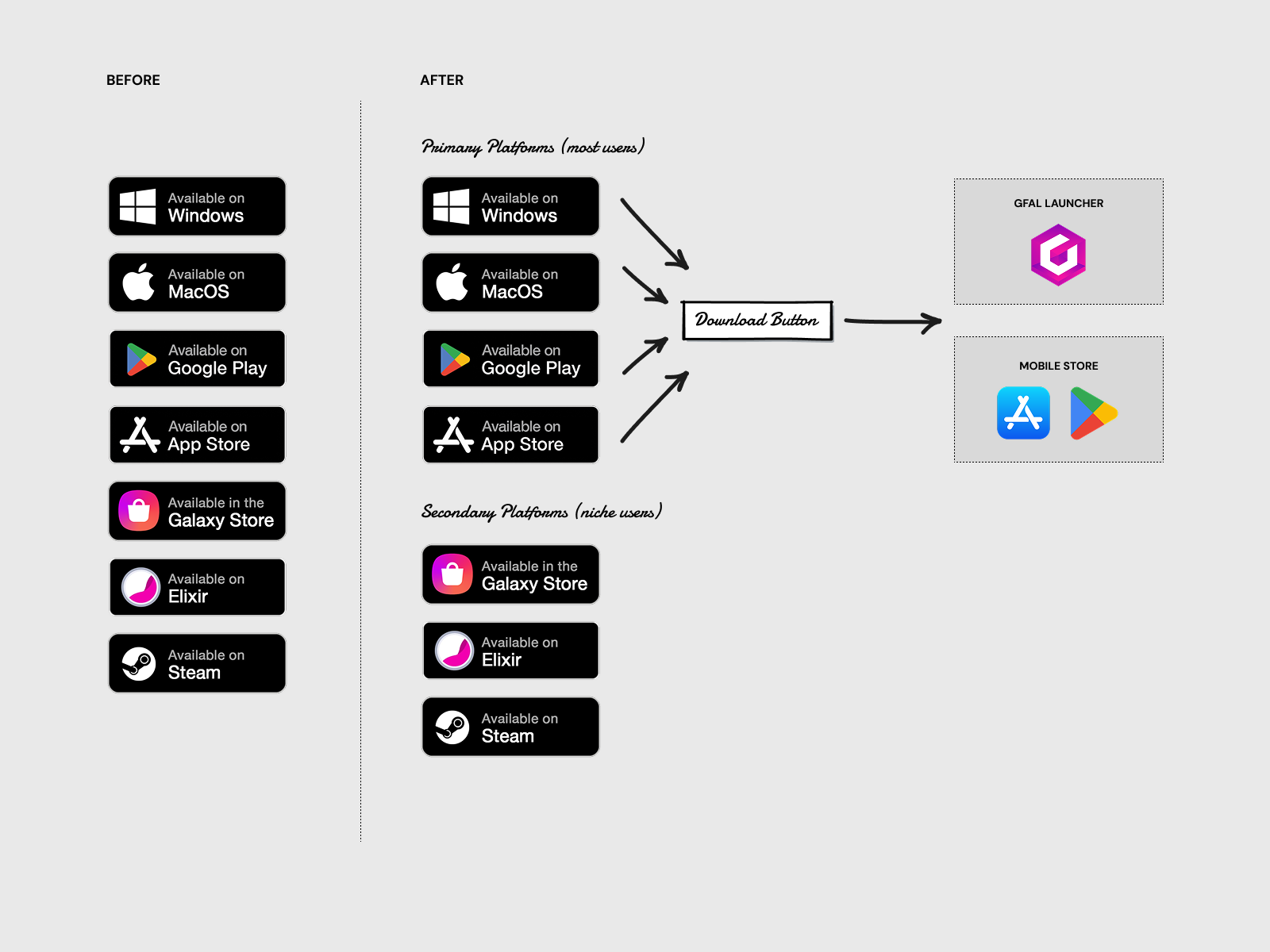
Smart Routing
We decided to use a single button to manage all downloads and redirections.We implemented OS detection to handle logic behind the scenes. Mobile users were routed to stores; desktop users redirected to the launcher page where they received the correct .exe or .dmg automatically.
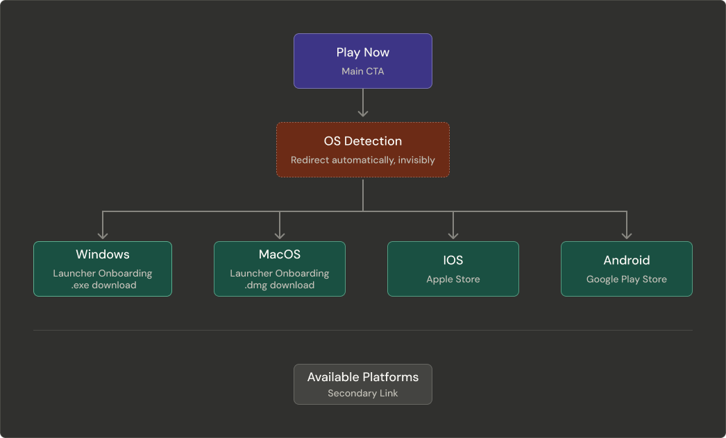
Smart Routing
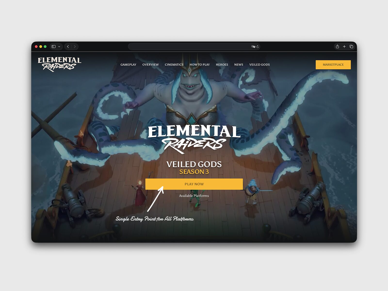
Reframing the CTA
We shifted from the initial idea of "Download Game" (a technical process) to "Play Now" (the player’s goal). This label remained true whether the user was headed to the App Store or downloading the launcher.
Clear Call-to-Action
Parallel Onboarding
For desktop, we designed a three-step visual guide to run alongside the download. By showing the launcher’s UI in the guide, we turned a "surprise" into an expectation.
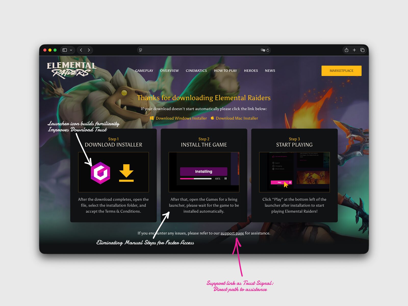
Parallel Onboarding
5. Prototyping
Prototypes focused on the "high-risk" moment: the automatic download. We tested the "Available Platforms" link as a low-friction escape hatch. This allowed power users to find specific versions (like Steam) without interrupting the "one-click" experience for the majority of the audience.
All Available Platforms
6. Testing & Validation
Testing confirmed that "invisibility" was the right approach. Users didn't want to be asked what OS they were on; they wanted the right answer provided for them. The three-step onboarding page successfully normalized the installation process, and the launcher rebrand created a "single coherent journey" from the web to the first game session.
Introducing Crystal for reinforcement
7. Post-Launch & Iteration
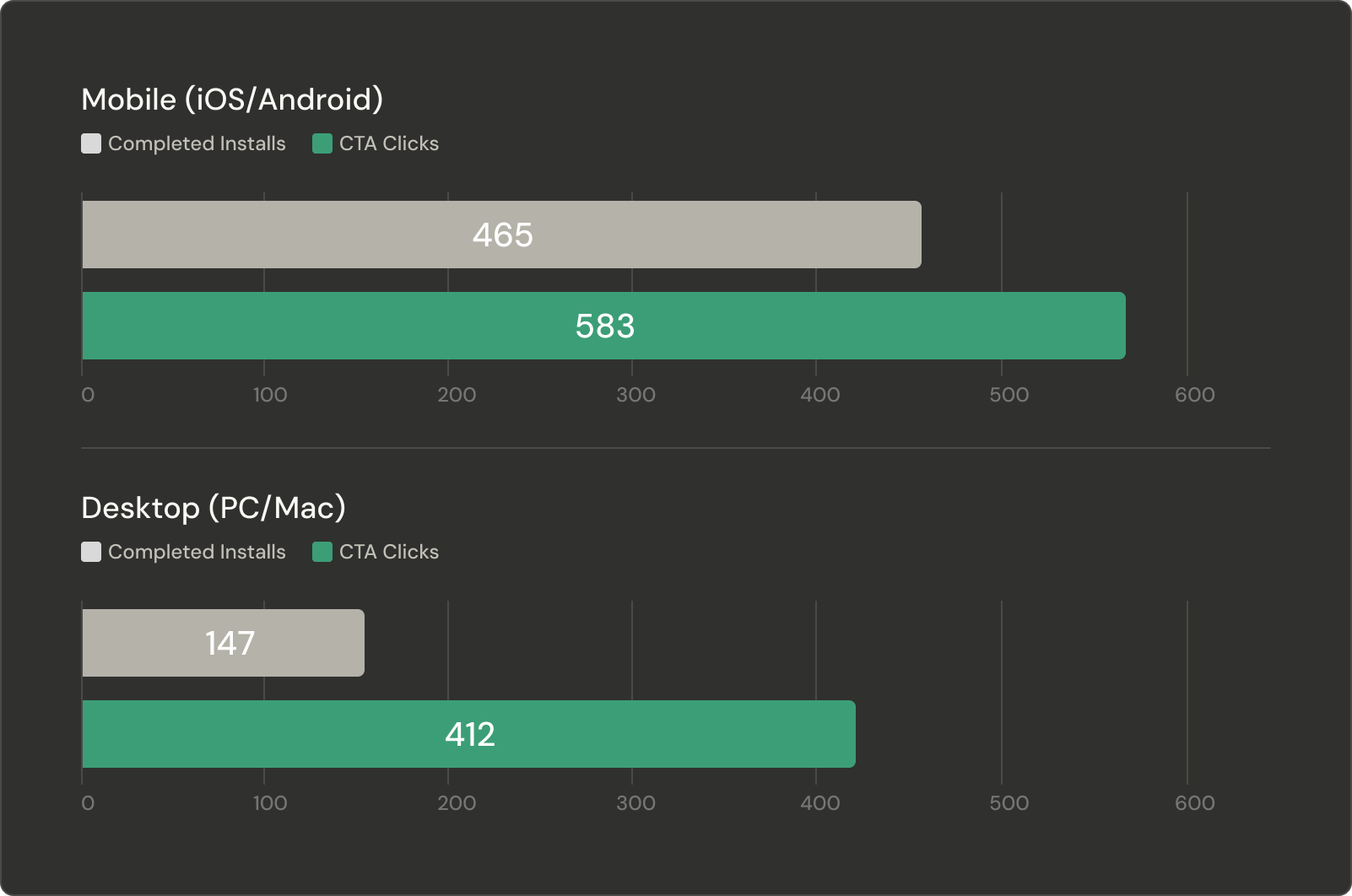
Post-launch data showed a marked increase in installer completions and a decrease in installation-related support tickets. Beyond the immediate metrics, we created a repeatable model for GFAL. What began as a generic launcher became a branded asset, capable of absorbing future titles and platforms without further redesign.
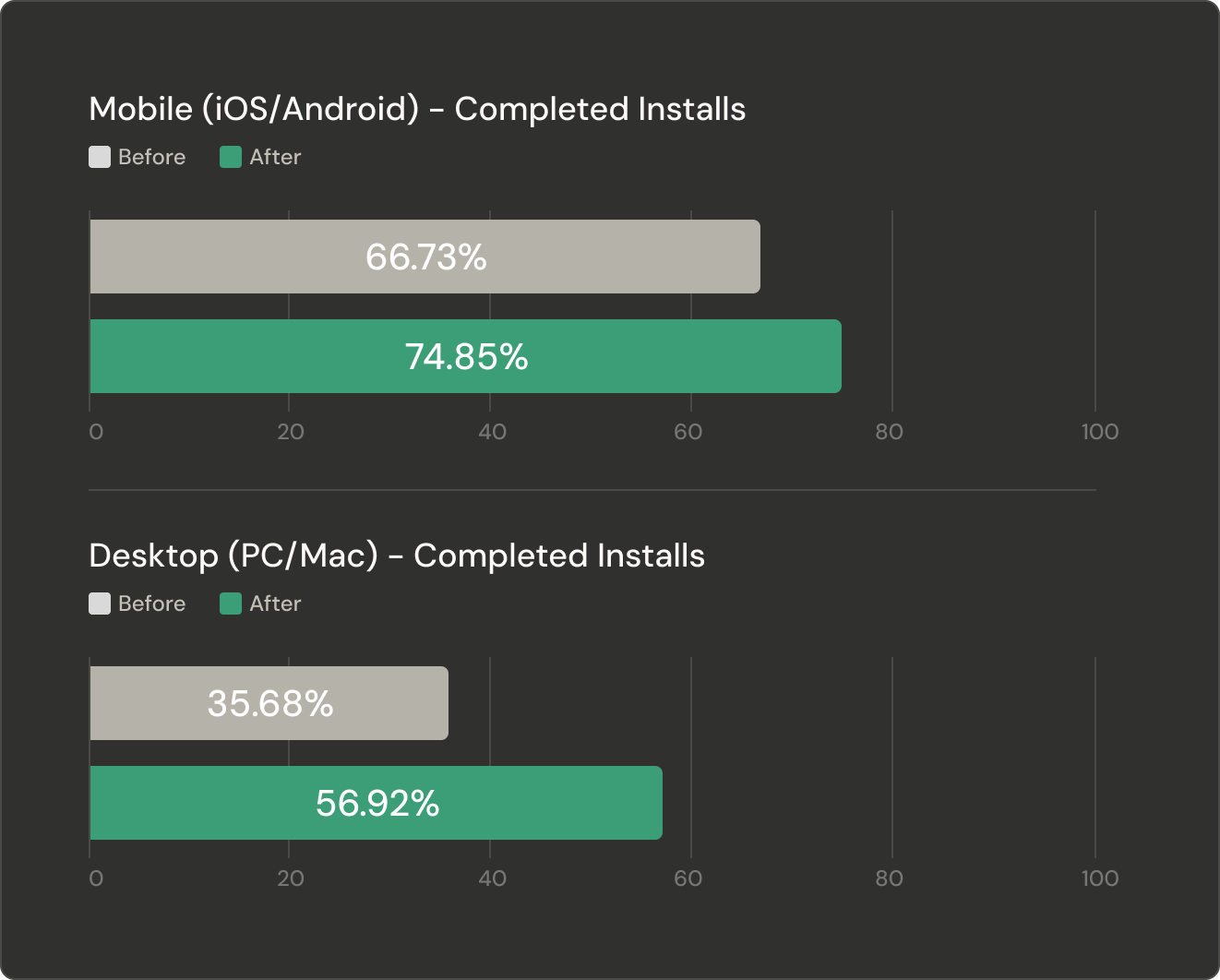
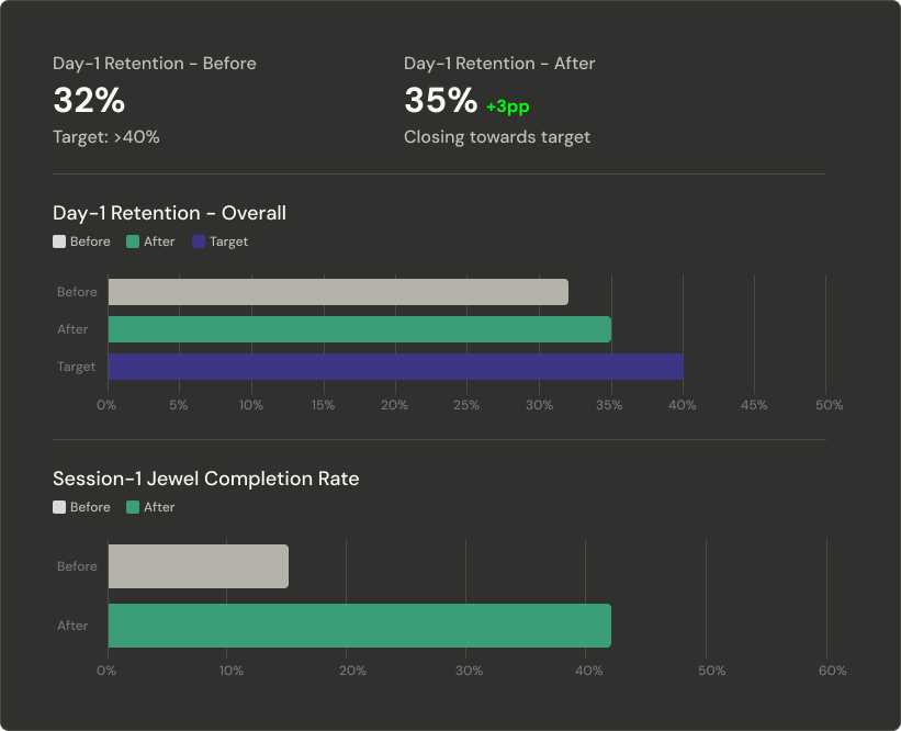
Post Launch Analysis